Vogue and Didot
http://www.eyemagazine.com/feature/article/through-thick-and-think-fashion-and-type

This article talks about early nineteenth century typfaces of Firmin Didot, which introduce an contrast between thin and thick sections of the letters.
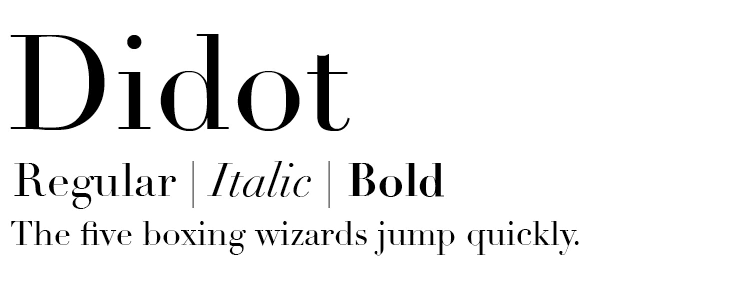

These fonts featured exaggerated height of the ascenders and descenders of letters which was said to be inspired by architecture of the time. Bodini described the 'beauties of type' as conformity without ambiguity. His typefaces had benefits sich as sharpness and definintion to letters which was like what was wanted to be captured by the photography of the models and their clothing.

Here we can see a Didot typeface for the Vogue Korea magazine, and it's instantly recognised as an iconic typeface for the magazine and it's genre. It's still very much applicable for an modern market as proven in this example despite being conceived so long ago.

The Didot font has been used here in this Wall Street Journal magazine article featuring David Beckham. Here we can see how applicable and relevant still the font is to a modern market. It resembles everything that the article and photography are demonstrating, elegance and beauty. The font works really well in the way it contrasts from being bold and thick in areas, to really thing and sharp. In a way it resembles the model and works to reaffirm the photography, here we have a male model which displays masculinity and stereotypical male features, but contrasting that is his clean and sharp image. Overall I feel this font works really well in articles and cases where elegance and sharpness is needed to convey the mood of the article.
Experimental typography

In this double page spread article, we can see a typical layout of one side dedicated to photography of the model and the other half dedicated to introducing the article. In this one, the W, which is the start of the model's last name is blown up to take up the whole of the page, with then inside of it in a section an area which introduces the piece. I like how firstly two different types of font has been used, firstly a serif font for the huge 'W' and then a sans serif font for the introductory text. These two contrast each other in a way that works really well. The serif font is hugely linked to classical fashion print and elegance also, but the usage of the sans serif inside gives more of a modern feel which works really well. The huge 'w' is used more in an expressive and aesthetic way rather than to serve any purpose as a letter and this abstract form looks really good and feels applicable to modern conventions.

What I like about typography in this genre of magazine and print is that it's really expressive, and follows no rules. It expressed what the article is about and gives a visual representation of what the article is on or about showing an insight into the personality of the model. It's showing traits of rebellion against layout in the way that the type doesn't even fit perfectly on the page and how different letters of her name are of different size and positioning. But despite not conforming to rules of type, it still manages to look elegant in the process showing that conforming to rules doesn't mean ugly typography.

For this article on Cate Blanchett, the type of the word Cate is phenomenal in the way it flows and looks visually. What I like about this one is despite the letters being organised with no alignment, it creates a lovely pocket of space which has been used to introduce the article, which cleverly makes the whole typography seem natural and not unorganised.

Another typography trend in this genre of print is the use of empty space, as presented on the left page that there is large gaps in between sections of text, which aren't evenly distributed. Again this is a form of rebellion against convention which works really well. I like the way that two lines of text overlap each other and the contrast in colour makes them seem natural. On the right as well, the text runs off the page entirely despite being plenty of space for it to fit. Despite this it's clear what it says and I like the way despite it being cut off, the type still works and looks elegant.

In this one, I like how the typography take course over two pages on the same line, combining the two pages to make a larger overall piece. This works really well despite being totally unnecessary, but what I've learned is that typography in this genre doesn't have to be justified. It prides on being expressive, different and unique, conveying the mood and personality of the artist, the clothing or the model in the piece.

This example perfectly demonstrates how expressive type can be used to create beautiful imagery. The word riders really takes on the meaning of the word, as it's all over the place, letters and hanging off other letters and really makes the piece feel kinetic and alive.
No comments:
Post a Comment