Wednesday 30 November 2016

Sport fashion photography


Sport fashion photography

Gymshark


In sports fashion photography, it's all about making the subject seem as powerful and enhanced as possible due to the fact they're wearing the particular product they are. A company that does this well for their products is Gymshark, they take on large social media figures and set them in scenario's which give a sense of power to the viewer. Overall, they are very well exposed and bright showing a positive mood for the photographs, that the subject has been empowered by the product. They also use high apertures which really focus in on the subject, blurring out the backgrounds making them seem even more important. In some instances they also feature close ups which furthermore super impose the subject which makes them appear larger than life and surreal.


Nike


Tuesday 29 November 2016

Portrait photography influences from social media


Portrait photography influences from social media


Sean Newton


Danny Heredia


Digital Magazine's

Digital magazine's

Digital magazine's are essentially an digital version of a magazine. They offer users an alternate method of experiencing their publication other than a physical paper form version. These digital magazines can have their benefits. For example from an environmental perspective, there is no paper and raw materials being used in the creation of the product meaning the environment is benefiting from this version. Secondly, it can be more interactive, for instance in print you are limited to physical features, but on the digital version, sound and video can also be implemented to help build the finished article. Also, it can benefit the user to simply click on the section they want to go to instead of scrolling through the paper to find what they want. Also, it takes up less space, you can carry as many as your storage will allow with you which makes it easier to carry your favourite magazines anywhere with you.

Vogue

I downloaded the vogue digital magazine to get first hand experience on how it looked visually, how it handled and what interactive features it had to make it differ from it's physical version.

The first screen you are brought to is the cover, which looks a lot like a typical print magazine cover, taking over it's physical conventions. However, where the different articles are, they are literal links that the user can tap and take them to immediately inside the magazine.

Displaying IMG_5183.jpg

Visually, it looks very nice when you go to an article, there's images that look as good as print followed by a title and insight to what it's all about. What disappoints slightly is that this styling is on each article, meaning that the personality and original design of each one is taken away for a more generic and commercial design which can be applied to each article.

Displaying IMG_5184.jpg

Displaying IMG_5185.jpg

However despite this ultimately it does look nice and clean visually. The text is clear and the stand out quotes are visible via change in typography. Overall it was a good visual experience and one that benefits from a digital version.

Displaying IMG_5186.jpg

Layout in fashion magazines


Layout in fashion magazines

I like this example of layout on the left hand page and how it reflects the mood of the overall article. I like how it's not exactly aligned perfectly with both columns being offset, as well as this they're not centrally aligned meaning it's not applying to print convention. Overall it helps reflect the mood and the styling of the article of being a different perspective and trying to break the rules and stand out and it works really well.


Same with this one,  I liked how the columns of text are floating around the images and graphic features creating a unique flow to the page, it really applies well to the imagery which surrounds the piece and gives a abstract feel. I like how the use of bold colours are used which contrast each other effectively.


Firstly, I love the imagery on this one, the editing to create a really abstract feel looks really fascinating, with the features being pasted and blended well over the hand and the arm. Secondly I like the arrangement of both text and images on this article. They continue on from the strange nature of the images with how the text is spread around.


I like how simple this example is in comparison to the others, showing it doesn't have to be really abstract to look good and unique for the article. I like how it's split into three columns in the middle which are all evenly distributed. As well as this, I like how the typography of the title really contrasts the main text but despite this really compliments the simplicity.


For this article, I like how the images and text all overlapped each other resembling a photobook feel. It feel like the images and text have been just cut out and arranged by hand, it gives a real natural and personal feel to the article and the black and white and faded images give a dated look with a bold amount of white space around all the features.

Image result for layout fashion magazine

I really liked this example and in particular how all the text wraps around the image making it combine into one large piece. I like how the number six is arranged like it is going through the model creating a natural effect and not like the text has been added or placed on top of the image. 


Typography in fashion magazines


Vogue and Didot

http://www.eyemagazine.com/feature/article/through-thick-and-think-fashion-and-type
EYE65 ABBOT 02

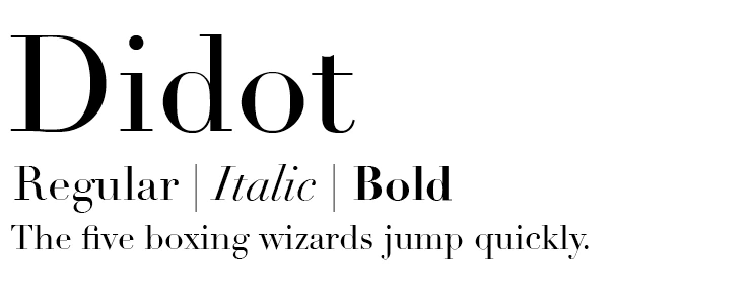
This article talks about early nineteenth century typfaces of Firmin Didot, which introduce an contrast between thin and thick sections of the letters.

Image result for didot font

Image result for didot font

These fonts featured exaggerated height of the ascenders and descenders of letters which was said to be inspired by architecture of the time. Bodini described the 'beauties of type' as conformity without ambiguity. His typefaces had benefits sich as sharpness and definintion to letters which was like what was wanted to be captured by the photography of the models and their clothing.

Image result for didot font on magazine

Here we can see a Didot typeface for the Vogue Korea magazine, and it's instantly recognised as an iconic typeface for the magazine and it's genre. It's still very much applicable for an modern market as proven in this example despite being conceived so long ago. 


The Didot font has been used here in this Wall Street Journal magazine article featuring David Beckham. Here we can see how applicable and relevant still the font is to a modern market. It resembles everything that the article and photography are demonstrating, elegance and beauty. The font works really well in the way it contrasts from being bold and thick in areas, to really thing and sharp. In a way it resembles the model and works to reaffirm the photography, here we have a male model which displays masculinity and stereotypical male features, but contrasting that is his clean and sharp image. Overall I feel this font works really well in articles and cases where elegance and sharpness is needed to convey the mood of the article. 

Experimental typography


In this double page spread article, we can see a typical layout of one side dedicated to photography of the model and the other half dedicated to introducing the article. In this one, the W, which is the start of the model's last name is blown up to take up the whole of the page, with then inside of it in a section an area which introduces the piece. I like how firstly two different types of font has been used, firstly a serif font for the huge 'W' and then a sans serif font for the introductory text. These two contrast each other in a way that works really well. The serif font is hugely linked to classical fashion print and elegance also, but the usage of the sans serif inside gives more of a modern feel which works really well. The huge 'w' is used more in an expressive and aesthetic way rather than to serve any purpose as a letter and this abstract form looks really good and feels applicable to modern conventions.


What I like about typography in this genre of magazine and print is that it's really expressive, and follows no rules. It expressed what the article is about and gives a visual representation of what the article is on or about showing an insight into the personality of the model. It's showing traits of rebellion against layout in the way that the type doesn't even fit perfectly on the page and how different letters of her name are of different size and positioning. But despite not conforming to rules of type, it still manages to look elegant in the process showing that conforming to rules doesn't mean ugly typography.


For this article on Cate Blanchett, the type of the word Cate is phenomenal in the way it flows and looks visually. What I like about this one is despite the letters being organised with no alignment, it creates a lovely pocket of space which has been used to introduce the article, which cleverly makes the whole typography seem natural and not unorganised.


Another typography trend in this genre of print is the use of empty space, as presented on the left page that there is large gaps in between sections of text, which aren't evenly distributed. Again this is a form of rebellion against convention which works really well. I like the way that two lines of text overlap each other and the contrast in colour makes them seem natural. On the right as well, the text runs off the page entirely despite being plenty of space for it to fit. Despite this it's clear what it says and I like the way despite it being cut off, the type still works and looks elegant.


In this one, I like how the typography take course over two pages on the same line, combining the two pages to make a larger overall piece. This works really well despite being totally unnecessary, but what I've learned is that typography in this genre doesn't have to be justified. It prides on being expressive, different and unique, conveying the mood and personality of the artist, the clothing or the model in the piece.


This example perfectly demonstrates how expressive type can be used to create beautiful imagery. The word riders really takes on the meaning of the word, as it's all over the place, letters and hanging off other letters and really makes the piece feel kinetic and alive.


Monday 28 November 2016

Online fashion blogs/websites

Topman fashion blog


Topman's fashion blog section to their website is a good example of what is currently circulating across the fashion market. Initially the user is brought to a website where each blog entry is presented in a grid format, the format is very evenly distributed, and aesthetically looks balanced and well presented.

After this the user is bought to the blog where it is made up of images of a certain look and style with words to accompany the look, how to wear it and so on... For me, the images look fantastic. The photography is well balanced and has a traditional style to it. What I like about the images used here is the montage style that is being used. I like how different textures and images help convey the mood and theme of the look and creates a good visual vibe for the outfit. 

The accompanying text is quite bland how it is presented. Arguably the text is the less important part of the blog post with it being mainly focused on the imagery. However if the text was displayed in a way that was less generic and plain it would encourage the user to acknowledge the text more than they are likely to.


River Island


For River Island's fashion blog section, they too have gone with a grid system to display their various entries. However, differentiating from Topman's the images aren't in a uniform size. This breaks consistency meaning that it may not perhaps be as visually pleasing to different audiences, however, what it does to is to help make certain posts stand out from the others. The ones that break the convention could perhaps be more likely to bait clicks from users. Ultimately, this could be used to promote bigger fashion stories or generally more exciting posts.

The format for the blogs are similar to topman, with it being mainly image driven for the user, with less exciting promotion of the text. I feel that the blog entries which don't have as visually exciting imagery could benefit from differentiation in typography, resulting in an overall more balanced article. Despite it not necessarily exciting, the change in type for the 'vs.' does stand out from the other text meaning it is possible to entice the audience's attention to the accompanying text through differentiation of typography.


Asos

Asos alike the other's have similar styling and approach to their blog posts. Again I feel like they are missing out on making their content as engaging as it could possibly be. I feel the text to be boring and not engaging which means that it has the potential to be ignored, voiding it's reason of being there to accompany the image. Again, different use of font, layout and composition could be used to help make the piece more engaging for the viewer.

Tuesday 22 November 2016

Some practise pieces of sports fashion photography, experimental.

For these photographs I wanted to just experiment with fashion related photography and try to capture a quite urban and grungy feel. This piece of work fell in line with some work I was doing for an actual brand Vypex Apparel.


For this one, I wanted to show that the product and the overall look was appropriate for it's environment, I wanted the subject to look like he belonged there. I found this alley with a lot of graffiti and a lot of broken and derelict features. The lighting on the following sequence of photo's is very low and I felt like this was appropriate for the setting, there was one street light that lit up the area as the sun was set. I really lowered the exposure to keep it quite grungy and really played to the environments advantages. 


On this one I tried to focus on the subject more than the environment, the way he was facing meant that the light was cast onto one half of his face, and the other being under exposed. I found that this was a good look that resembled the feel for the environment and the look of the outfit and clothing.


This portrait shot behind the subject is fitting for the market and the overall look. Being a sports brand it was showing the subject going from the dark to the light, representing using their clothing will help you to achieve your goals. I feel these photographs could look well in a magazine article dedicated to sports fashion.


Men's fashion photography initial look


Image result for mens fashion photoshoot


Image result for mens fashion photoshoot


Image result for mens fashion photoshoot


Image result for mens fashion photoshoot


Image result for mens fashion photoshoot


Image result for mens fashion photoshoot


Image result for mens fashion photoshoot


Image result for mens fashion photoshoot


Image result for mens fashion photoshoot

Initial look at independent fashion magazines


INDIE

Image result for independent fashion magazines content

I liked the style of the indie magazine for many reasons. Firstly I liked how it broke general convention when it came to general rules of composition. For example on the left, the image isn't centre aligned in conjunction with the background behind it. I felt like this conveys the magazines style and it's personality if you would instantly through it's cover. That is to break tradition from the general format but to still be appealing ultimately. As well as this, I liked the imagery, I feel like it's trying to be controversial in order to shock certain viewers into reading it. As well as this, I like the limited use of text and buzz words to reel audiences in. The simple nature and the great imagery all make for a good brand identity for the magazine.


Image result for independent fashion magazines content

Garment

Image result for independent fashion magazines content


What appealed me to the style of this magazine was two main things, the use of typography and the backup imagery. Firstly, I think the use of typography is beautiful. The branding for the magazine differentiates from the norm of using a serif or a plain sans serif font in a large size at the top of the cover supported by the imagery for the main article. I like how it's dysfunctional and not aligned. I like how it doesn't flow and how the lines break up the letters, it works very well and is unique. As well as this the supporting text contrasts this, it's very subtle and uses a soft and approachable sans serif font to help balance the cover. Despite this however it doesn't follow a particular layout which helps keep it unique. The imagery also is lovely, it contrasts the text by being in black and white and isn't very heavy with a lot of white space. Overall the balance and originality of the magazine cover works really well at breaking conventions.


Image result for independent fashion magazines content

This cover also is very nice in the way that it is simple and easy to look at. It doesn't feature and complex or unique branding but keeps things easy and simple with a sans serif typeface which contrasts the other text with the use of colour. The imagery on the front is simple, despite being a famous and well known actor to draw readers in, it's very balanced and well composed taking up the whole cover.


Image result for independent fashion magazines content